In 1877, Florence Nightingale penned a letter to her brother-in-law: “I know no class of murderers who have killed so many people as hospital architects. At this moment, there are many diseases less fatal in the most wretched homes than in hospital.” Nightingale, in fact, had a good relationship with architects, but she understood their vital role in the success, or failure, of what are perhaps the most complex buildings to create, operate and maintain.
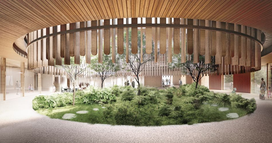
Nearly 150 years on, I’m at the Royal Academy of Arts’ Herzog & de Meuron exhibition, watching a young boy interact with one of the exhibits. “It’s like a computer game, you can play it like Nintendo,” says the gallery attendant. The “computer game” entails holding a console in both hands, navigating on a screen the passage of a little girl around Kinderspital, a children’s hospital in Zurich due for completion in 2024. Racing against the clock, the little girl whizzes past a timber and plant-filled atrium towards an information desk, down corridors and into surgical theatres, collecting points that bleep into the quiet exhibition space. The impression of the hospital is of an upmarket hotel.
Nearby, having downloaded an app, I’m using augmented reality to view one of Kinderspital’s bedrooms on my mobile phone. Swivelling my screen around the physical exhibition space reveals the virtual presence of biophilic or “nature-based” design elements (the patterns, repeats and materials we find in nature). A child-sized table and chair are made with organic, pleasing curves. The ceiling is made of wood, the natural grain visible. Generous light is brought in through a large window, while a wooden porthole for ventilation, latticed and lowered to child-size height, suggests the contained cosiness of a wood cabin. As well as a bed for the child patient there is a comfortable, spacious daybed for parents to sleep in. As I step into the ensuite bathroom, I see a little stool tucked under the sink so that smaller children might reach up and brush their teeth in the mirror. The overall look is friendly and calm. Inviting, even.
This is ironic; hospitals are realistically the last places we would choose to visit. They serve, however, as a crucial litmus test of the health of our welfare state—and as such are a politically fraught subject.
Three years ago, having emphasised it in his 2019 election manifesto, then-prime minister Boris Johnson promised 40 new hospitals by 2030 as part of an initiative called the New Hospital Programme (NHP). Its remit included coming up with a standardised hospital design, titled Hospital 2.0. Today, Johnson’s promise looks thus: eight hospitals won’t be built by 2030, many of the others won’t be “new builds” at all (acknowledged in May this year by health secretary Steve Barclay) while a further seven hospitals, five of which aren’t included in the initial target of 40, will require rebuilding, having been constructed with reinforced autoclaved aerated concrete (the dreaded, dangerous “Raac”). Challenges recruiting technical staff to draw a modular building template have slowed the process, while the National Audit Office has voiced concerns that budget restrictions and inaccurate anticipation of demand may result in too-small hospitals.
We might be left wondering if perhaps an identikit, one-size-fits-all approach isn’t what’s required. But then, what is the role of architecture in hospitals, and how much can design meaningfully impact a hospital space and those who use it?
Some septuagenarians are surprisingly sprightly. Yet our ailing, 75-year-old NHS estate is creaking, modelled on flawed notions of efficiency and utilitarianism. If you’ve been inside a hospital over the last 50 years, the following may sound familiar: confusing rabbit warrens with incompetent signage, narrow corridors, terrible acoustics, fluorescent lights, unnecessary bleeping, too high windows (therefore no view), neighbouring beds edged close enough for patients to hold hands, bad food heated in vast hospital basements.
“We can’t have this conversation without talking about Florence Nightingale,” Stephanie Williamson tells me over Zoom. Williamson is co-chair of Architects for Health, a forum for sharing knowledge and information on hospital design, and her 41 years in the NHS culminated in director roles at Great Ormond Street Hospital (GOSH) and Guys and St Thomas’, both in London. One of her recent projects involved helping design the multiple award-winning Zayed Centre for Research into Rare Disease in Children at GOSH. “We hear presenters quoting Nightingale every year at London’s European Healthcare Design Congress. She revolutionised hospital design and hospital management. Her work on light and noise control remains unchallenged.”
Nightingale also believed nurses and staff deserved a comfortable, safe working environment, including sculleries and private, good quality accommodation. In more recent years, design decisions have been less favourable for those caring for others. “Under Tony Blair’s PFI [Private Finance Initiative] era, 100 hospitals were built for minimal cost,” Williamson tells me. “To save money, staff rooms on each floor were scrapped for one centralised space, often too far to reach in break times. Overworked staff were left scavenging empty patients’ rooms. Bad will all round.” (The Institute for Public Policy Research, a thinktank, has calculated that the PFI bill will eventually be paid off by the NHS at an astounding £80bn cost.)
The valuation of buildings without accounting for the cost of human experience is a familiar story. In his new book Humanise: A Maker’s Guide to Building Our World, published this month, architect Thomas Heatherwick writes: “All over the world, wherever we’ve seen money become a dominant value, we’ve seen the rise and spread of buildings whose success or failure is judged mostly on how much profit they make.” He posits, via Paul Morrell, the UK government’s first chief construction officer, that the value of a building should lie not in its monetary value but its creative power. “In a hospital it should be patients healed; in a prison it should be the number of inmates who go back into society and don’t reoffend. The question shouldn’t be ‘How many square feet can I get away with stacking on this site for the least amount of money?’ It should be, ‘What works?’”
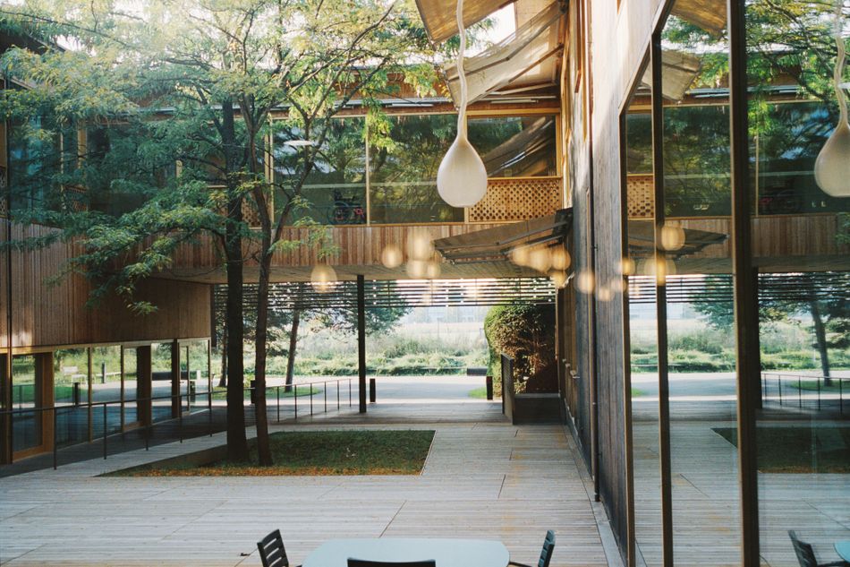
Enter exceptional healthcare architecture. The 40-year-old Swiss practice Herzog & de Meuron has over 600 projects under its belt, including the Tate Modern and Hamburg’s Elbphilharmonie. Twenty years ago it unveiled REHAB Basel, a clinic for neurorehabilitation and paraplegiology. The clinic, a horizontal two-level structure, was the firm’s initial exploration of how spatial and sensory experiences aid the healing process. The all-single occupancy bedrooms were built with skylights, giving airy overhead views for bedbound patients, while wide corridors offer ample space for wheelchair users. Thought, too, was given to its external proportions, the building sheathed in a series of slim wooden poles lending an aerated atmosphere, as though it were breathing into the surrounding nature. Timber was used generously inside; the inclusion of wood in a hospital setting can play a significant role in reducing stress. (One Japan-based study from 2017 measured brain activity in people touching plastic, aluminium and wood for 90 seconds each, with wood shown to help induce “physiological relaxation”.)
“It’s not just a business decision for Herzog & de Meuron,” as Vicky Richardson, the curator of the RA’s exhibition, tells me over the phone. “They really feel like they have something important to contribute to hospital design. Hospitals often end up like factories, stuffed full of equipment, a hotchpotch of machinery with adaptations that dilute the quality of the space. But REHAB, Kinderspital, these are places you would choose to be. They are uplifting, part of your recovery.”
Joining Kinderspital’s completion next year—and also designed by the practice—is a Danish hospital located in the town of Hillerød called the New North Zealand Hospital (NNZ). From above, NNZ’s Gaudí-esque, four-cornered swirl echoes a fidget spinner nestled among acres of pristine meadowland—encapsulating Herzog & de Meuron’s approach of designing hospitals that neither look nor feel like hospitals. Plans by the practice are underway for a further hospital in California.
What is it that makes an architectural practice like Herzog & de Meuron, already globally known for institutions with a hefty cultural currency, so interested in reinventing institutional hospital typologies?
Over FaceTime, Christine Binswanger, a senior partner at Herzog & de Meuron who leads on their healthcare architecture, tells me: “I come from a family of psychiatrists and grew up in the clinic where my parents were working. That is maybe one of the reasons why I am interested in complex systems, and hospitals are amongst the most complex of all. Our work as architects is about observation. What are people doing? How do they behave in the space they are in?”
For Binswanger, like Nightingale, recognising everyone who works in a hospital setting is key when making design decisions—such as where to place the windows in an operating theatre. “Not,” as Binswanger tells me, “because the surgeon and operating staff need to look out, but because there are people who do nothing else but clean these spaces.”
This year is the 900th anniversary of St Bartholomew’s, or Barts, the UK’s oldest existing hospital still working on its original site. Speaking from the hospital Alison Cann, a built environment specialist, told me: “A hospital demands the same levels of care that a cultural space does. Everybody is fighting their corner when it comes to NHS money. It’s really important to bridge the gap between clinicians, architects, project managers and someone like me. Being aware of neurodiversity is important—using colour contrasts to help with wayfinding. We have staff wellbeing rooms, with lovely resting reclining chairs. One of the rooms has a pool table, designed and bought in the same colour as the rest of the room. We are really thinking about the environment for our staff.” She adds: “Why can’t a hospital look and feel like a really exceptional healing space for all?”
But where does the balance lie between institutional efficiency and humane environments? Can hospital design also improve efficiency? And can good design relieve the burden on an already beleaguered NHS?
One key feature positively impacting recovery rates is single occupancy bedrooms, which have been a long time coming. Stephanie Williamson, who became a healthcare planner 20 years ago, recalls making the case back then for single rooms in a specialist orthopaedic hospital. “The argument was that as a nurse would have to walk into six rooms to see six patients, you would need more nurses. But, in reality, you can’t walk into a six-bed bay and know simultaneously that those six patients are okay. You have to walk to check on two patients at the far end, because you can’t see them, especially if curtains are drawn. Equally, patient communication is better in a single room—a patient is more likely to say to the nurse, ‘I’m feeling really depressed today, really lonely, really poorly.’ When you’re vulnerable, it’s difficult being ill in front of strangers. So there is a better quality conversation. And you’re not hearing distressing information from other patients, because curtains aren’t soundproof. Nurses will spend more time with you, but not have to interact with you quite so many times. It’s quality interaction over quantity. And if you’re resting better, you’re using less painkillers.”
Alison Cann at Barts agrees. “Some of our staff will tell you they could look after patients better when the wards were open plan, but that is simply not true,” she says. The data speaks for itself: at Royal Liverpool Hospital, which opened a year ago and is 100 per cent single bedrooms, the length of patient stays has reduced by 12 per cent, while the efficiency with which beds can be “worked” has risen by 10 per cent. “It’s taken a really, really long time for the evidence to gather around single-occupancy bedrooms. It’s way too late, but it’s absolutely the direction of travel we should be going in,” says Williamson. “Perhaps the only downside is you might need more technology, like mats on the floor which get triggered when a patient gets up. Nursing homes already use tech like this.”
Williamson gives another example of how tech is impacting hospital design, this time at Southmead Hospital in Bristol. Built in 2014 for £430m and designed by Building Design Partnership, the hospital makes extensive use of robots for cancer surgery, pharmacy dispensation and food and linen transportation. They are “big beasts,” says Williamson, “who sort of tumble about on the floor like giant roller skates.” One bonus is that corridors were widened, allowing robots to comfortably pass alongside beds and people, enabling better acoustics and pleasant seating spots for visitors with views from windows.
But technology is only one half of the equation; the other is thinking about what kind of environments we want to build, right down to the materials we use. “Wood went out of fashion in hospitals because infection prevention and control said you couldn’t clean it,” says Williamson. “And bleaches would ruin wood. Yet wood’s natural anti-bacterial properties hadn’t been factored in, as well as its impact on wellbeing. At Great Ormond Street, I did a project where we managed to get wood panelling in the outpatient area for the first time in about 40 years.”
Of course, some hospitals are better equipped to create naturally stimulating environments by virtue of their existing location. In the NHP-backed plans to rebuild Whipps Cross Hospital, in east London near Epping Forest, there is a heavy emphasis on biophilic connection. Designed in collaboration between Ryder Architects, Hoare Lea and WSP, the aim is to create “a hospital in a garden and a garden in a hospital”, with the first phase of construction beginning next year. The new hospital will honour Whipps Cross’s history—it was originally built as a relaxing environment for convalescing First World War soldiers—by situating inpatient wards on the top four floors, giving patients views over Epping Forest. Natural light will pour into each ward from all sides, harnessed by the building’s height and square dimensions. Currently the site is 99 per cent concrete or tarmac, but that will also change: seven football pitches’ worth of park and water meadow are planned to create places to eat lunch and recuperate. Joining the practical and the aesthetic, this parkland will also help combat flash flooding, the increasingly regular occurrence of which has disrupted surgery at the hospital. Single occupancy bedrooms will play a key part here, too: while the current hospital has 17 per cent single occupancy, the new build will jump to 70 per cent.
So far as the litmus test goes, these new hospitals are all signs that a shift is happening in our approach to the welfare state. Roots are being put down for a more inclusive and open approach. But it’s not happening quick enough or in enough places for everyone to benefit. Other countries around the globe have made better gains: Malaysia, for example, has been designing hospitals around biophilic principles for around 20 years already, using greenery to mask the concrete exteriors. The relationship between autonomy, privacy and community still requires a lot of calibration.
“A hospital is a hotel that provides healthcare,” says Williamson. “You want your room, you want your bed, you want your own bathroom. You want to be able to order food service that isn’t crap. You might like a lunch place where you can meet others. Bur very few hospitals get to rebuild from scratch. Very few hospitals get to say, ‘We’re leaving that site because it’s rubbish, we’re building a hospital over here.’”
Heatherwick argues that “It’s time we insist that our buildings are ‘nutritious’ too, and nourish us as we encounter them.” If patients were rebranded as customers, would our government honour healthcare experiences differently? Would hospitals and healthcare facilities then be automatically conceived in the same breath as hotels, as Williamson suggests they should be? Would we expect and demand healthcare spaces that are “nutritious”, that suit all our needs, whether we be patient or hospital worker? Is it possible, even, to factor in joy? It takes financial cost, and it takes buy-in, particularly if you are wanting to build a fidget spinner in the wild. “Re-humanisation means nothing less than a shift in values,” as Heatherwick writes—or perhaps Herzog & de Meuron’s Christine Binswanger put it most succinctly when she told me: “It’s your choice to go to a museum or not. It’s not your choice to go to a hospital.”
Herzog & de Meuron is on display at the Royal Academy of Arts, London, until 15th October


